White Labelling the Hopp Portal
General overview
In order to get a more personalized look of the Hopp Portal, that is representative of the customer's brand, there are two major aspects that need to be taken into account: changing the logos that appear throughout the app, and changing the color scheme of the app.
The process for achieving this, is as simple as providing a few specifically named images, alongside some hex color codes, all bundled in a well-defined folder structure, and specifying its whereabouts.
First, let's look at the folder structure:
-
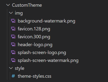
CustomTheme--
This is the root folder, where the Portal custom theme resides.
-
It should be a local path to a folder reachable by the Portal.
-
The name of the folder is not a hard constraint and can be changed as long as it is specified in the app setting, which we will look at a bit later.
-
-
img-
This folder contains the logos and representative images of the company the Portal is being customized for.
-
This must retain the name
img.
-
-
style-
This folder contains the style sheet which defines the color scheme of the company the Portal is being customized for.
-
This must retain the name
style.
-
By default, we've set up the path to the custom-theme root folder to be on the same level as the hosted application.
This can be changed by overwriting the property called SourcePath under the CustomThemeConfiguration appsettings from the Portal.
It can be either a relative or an absolute path, as long as it meets the constraints mentioned above.

In the following we'll be looking into the contents of the img and style folder, and how to set them up in order to obtain a brand-specific user interface.
Setting up a custom color scheme
This can be achieved by overwriting the default values of the color-variables from the main.css stylesheet of the portal, with custom hex color codes.
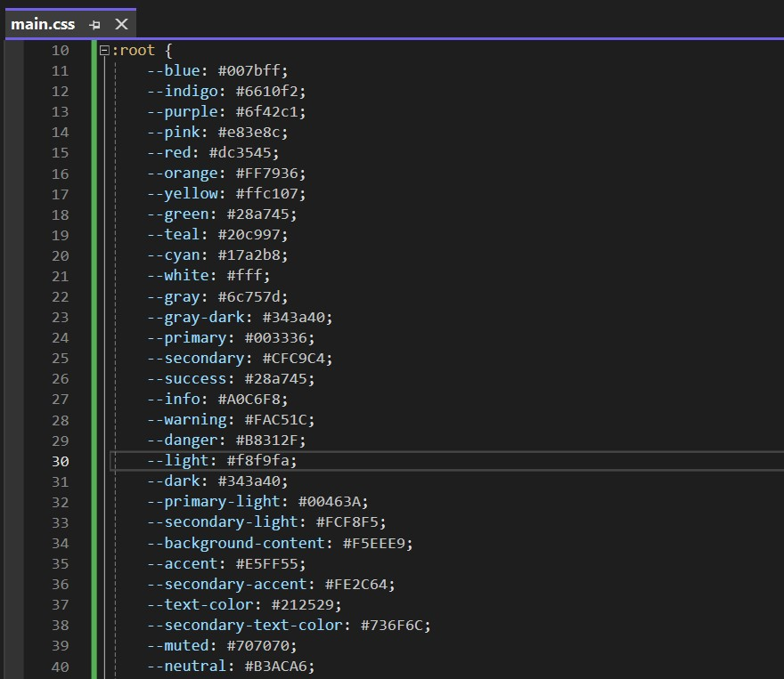
These variables can be divided into two separate categories:
-
Brand-specific variables are the representative colors for a company and make up most of the portal's color scheme. A list of these variables can be found below:
--primary--primary-light--background-content--secondary--secondary-light--accent--secondary-accent--text-color--secondary-text-color--muted--neutral -
Framework-specific variables
These variables fulfil very particular functionalities in the portal, such as defining colors for warning or error messages, and do not directly reflect the brand of the company. While these can also be overwritten, it is recommended to remain within certain guidelines, which we will get into at a later stage.
A list is presented below:
--blue--indigo--purple--pink--red--orange--yellow--green--teal--cyan--white--gray--gray-dark--success--info--warning--danger--light--dark
In order to overwrite these colors, we will make use of the style folder.
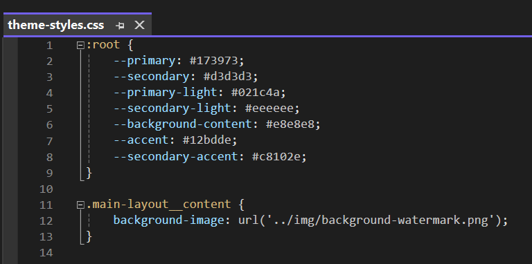
Within it, we need to define a stylesheet called theme-styles.css, in which we will be giving new values to the variables mentioned above.
The file should look something like this:
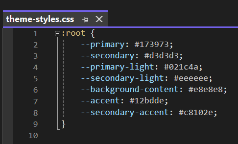
Notice that we've only overwritten a subset of the given colors, the ones that are predominant in defining the brand of the customer. While you have the possibility to change any of the colors within the color-scheme, most of them are globally applicable and independent of the branding.
Another aspect to take into account is the use of the same :root pseudo-class as in the main.css to reference the global variables.
This is a must in order for the customization to take effect.
In the following, we will take a look at where the colors defined by these variables are reflected throughout the portal, as well as some recommendations for defining them.
Brand-specific variables
--primary
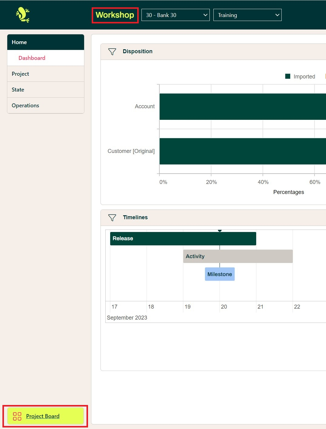
It is the dominant color present throughout the portal's theme. It can be found in the loading and login page, as well as in the headers of the pages and modals.
Recommendations:
- it should be a color representative for the brand of the company
- it shouldn't be very vibrant as it appears on large surfaces and in all the pages
- in case the representative color doesn't meet these criteria, try choosing a more toned-down version of it as the primary color
--primary-light
Represents a variation of the dominant color, used in more specific locations.
Recommendations:
- it should be a different tone of the same base color as
--primary - it can be lighter or darker than the primary color
- it can be more vibrant than the primary color, since it doesn't appear on large surfaces, like its counterpart
--background-content
Used as the background color of portal's main layout, the navigation menu items, as well as the headers of the cards displayed in the main view.
Recommendations:
- it should be a more neutral color that works well in combination with
--primary - vibrant colors should be avoided as it is present in most of the pages, and in some instances, on large surfaces
--secondary
This color is mainly used for borders throughout the application. It is a more emphasized tone of
the --background-content that shows a clear delimitation between two contexts
Recommendations:
- it should be a darker tone of the same base color as
--background-content
--secondary-light
Represents a lighter tone of the --background-content, and is used to highlight items that are of the
color --background-content or adjacent to it. The most notable use cases are the hover effects on the context and navigation menu items.
Recommendations:
- it should be a lighter tone of the same base color as
--background-content
--accent
The most notable use cases of this color are the messages on the loading and login pages, as well as the hover effects on the project cards and the bottom navigation buttons.
Recommendations:
- it should clearly differentiate from
--primary - it should be a more vibrant color, as its main purpose is to highlight specific elements or messages within a page
--secondary-accent
Another color used for highlighting purposes, it can be seen as the text color of the selected navigation menu item, and the icon color of the bottom navigation buttons. It is also the color used in the title of our custom error page.
Recommendations:
- it should be clearly visible on both
--primaryand--background-content - it should be a more vibrant color, as its main purpose is to highlight specific elements or messages within a page
--text-color
As the name suggests, this variable defines the color of the common text found throughout the app. The most notable instances of this color are the contents of tabular views.
Recommendations:
- should be a dark color
- should be easily legible on white background
--secondary-text-color
Used as the title color of projects page
Recommendations:
- should be a neutral color
- should be well visible on
--background-content
--muted
Used primarily as the color of the context-menu button as well as the text color of the context-menu items. It is also present in borders of the user icon and the login fields.
Recommendations:
- should be a neutral color
- should be well visible on
--background-contentand--secondary-light
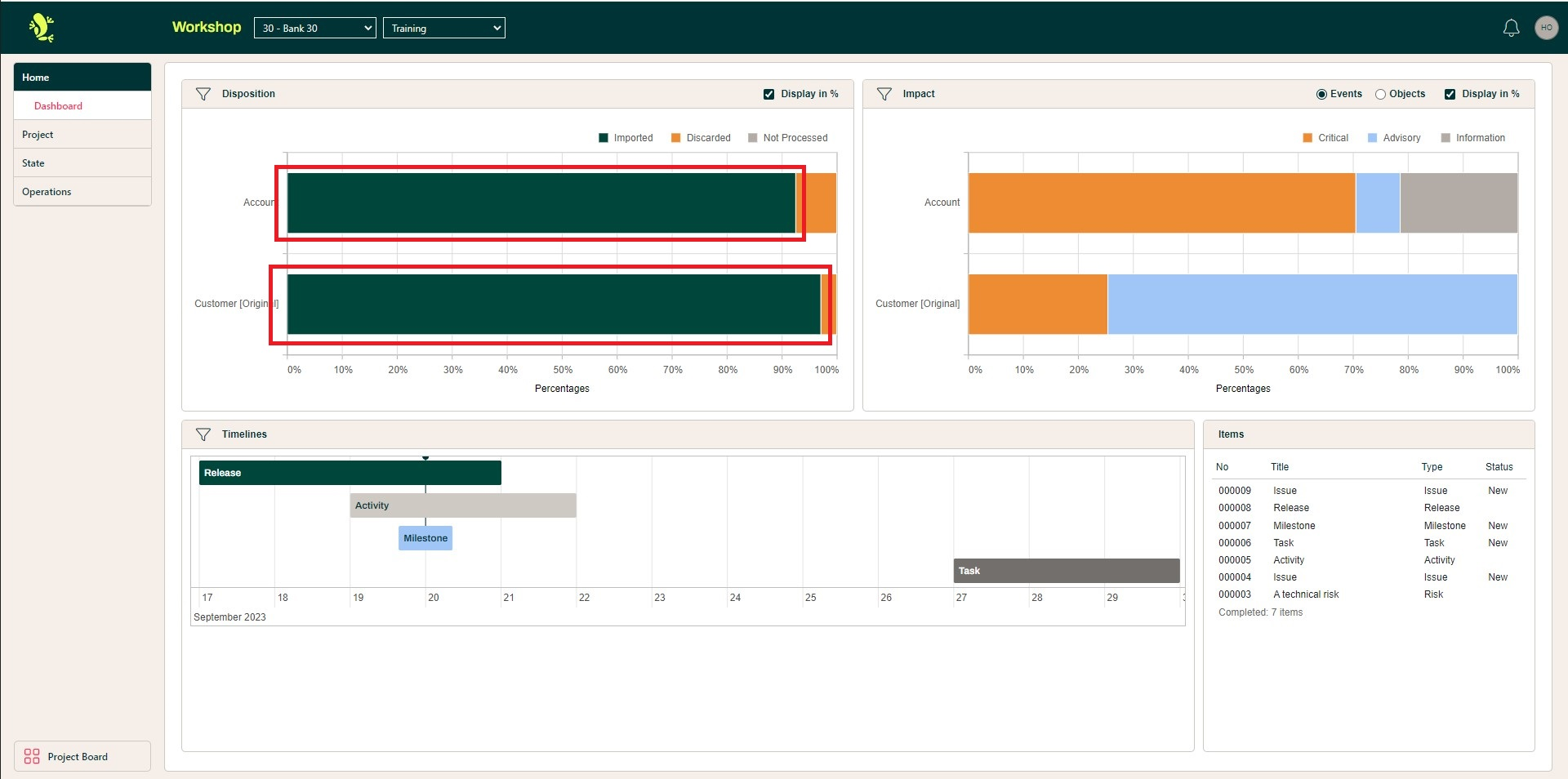
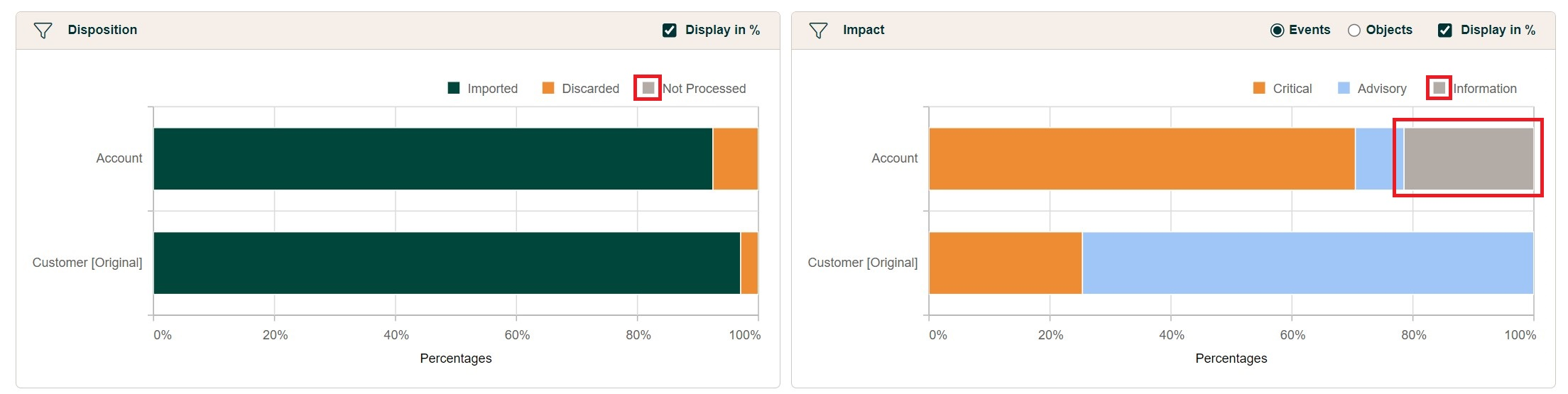
--neutral
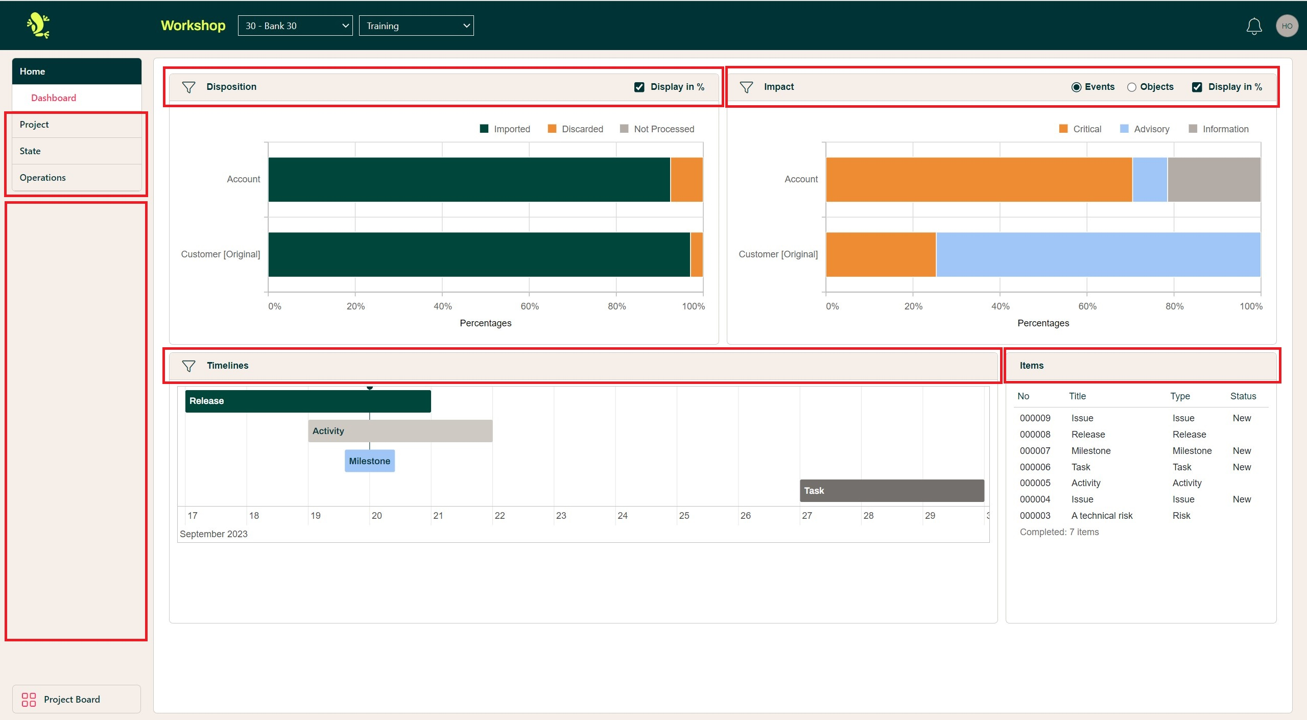
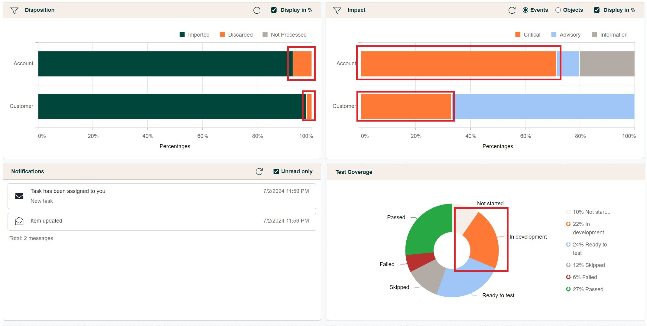
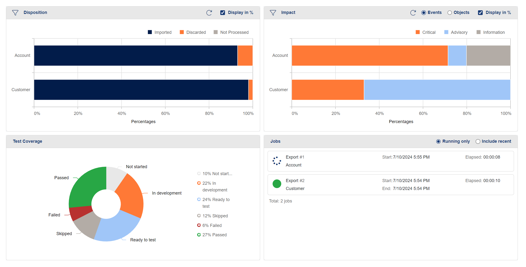
Used only in the Disposition graph for Not Processed and in the Impact graph for Information
Framework-specific variables
In case there is a need to overwrite these variables, it is recommended to remain within the following guidelines:
Variables that are named after specific colors should remain within the same hue, and only the tone of the color should be changed.
i.e. the variable name --orange should contain a tone of the color orange
There is a universal convention with regard to colors that indicate info, success, warning and danger (error):
--success: green tones--info: blue or gray tones--warning: yellow or orange tones--danger: red tones.
A list of the framework-specific variables used within the portal, can be found below:
--orange
--white
--gray
--success
--info
--warning
--danger
In the following, we will be looking into some notable usages of the colors defined by these variables.
--orange
Is mainly used in various widgets throughout the dashboard, where additional color coding is key
--white
Is present throughout the Portal mainly as the background color of most the components that are displaying data.
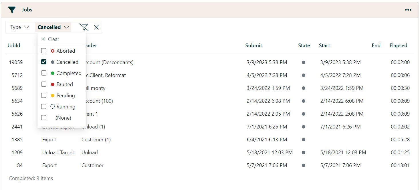
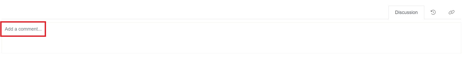
--gray
It can be found as the representation of canceled jobs, and also as the color of the comment text-area placeholder
Status indicator variables (--success, --info, --warning, --danger)
As the title suggests, these variables are used to indicate the statuses of various entities and actions. While they may not all be applicable in every case, the significance of these colors remains consistent throughout the app. Notable appearances are the job status, seen above, the accent color of the toast messages, suggestive of the status of the action performed, as well as the impact of the events.

Furthermore, the color defined in the --info variable can be found also in the graphical widgets.
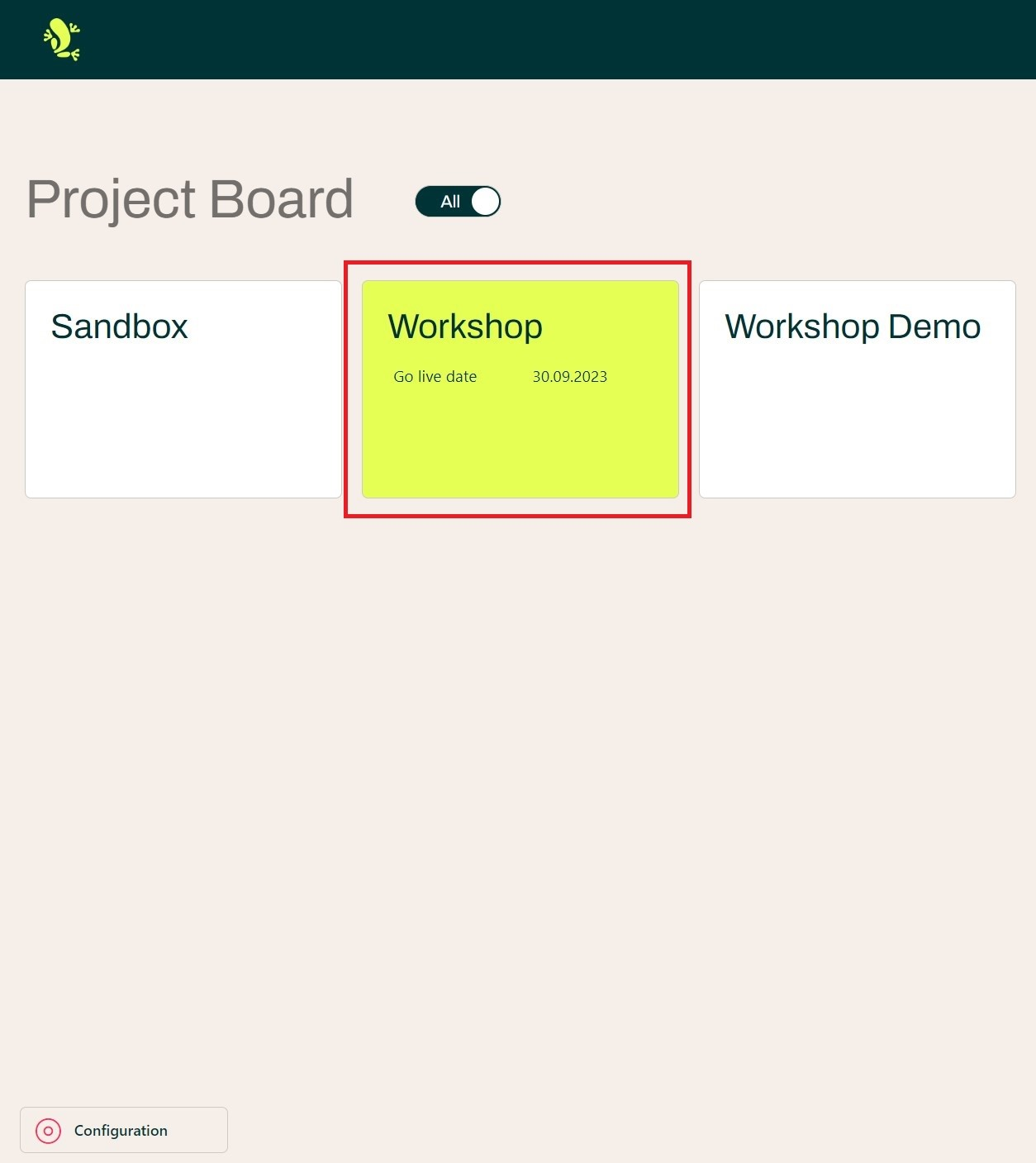
Setting up custom logos
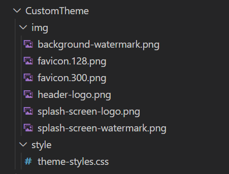
The Hopp Portal has six instances of brand-specific images, out of which only four are mandatory to be overwritten in order to obtain a custom branding. We saw a glimpse of these at the beginning, when the folder structure was presented.
This time we're going to use the img folder in which we will provide our own images to overwrite the Hopp-specific ones.
In order for this to happen, the names of the images must be set exactly as seen in the file structure.
In the following, we will take a look at where each image is used and what is the expected outcome when we replace them.
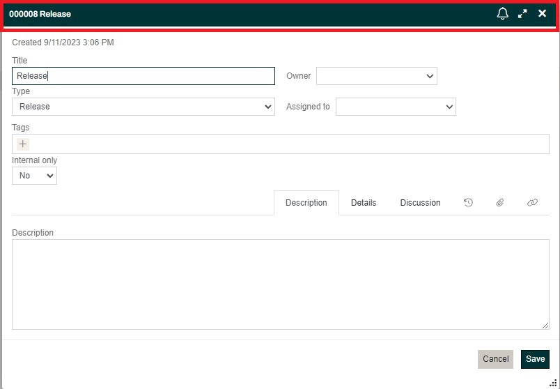
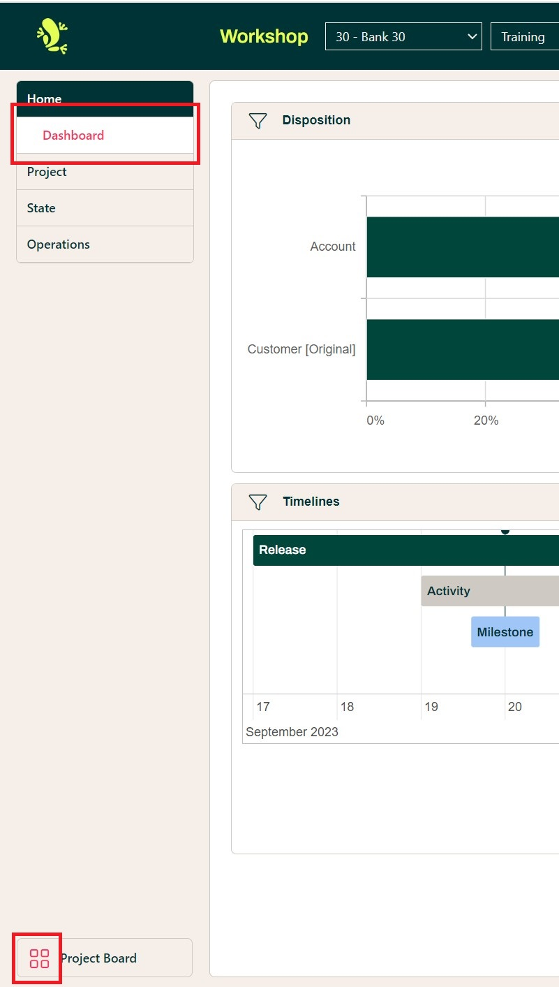
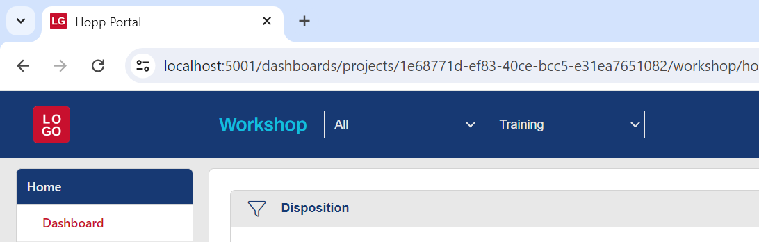
header-logo.png
This is the logo you see every time you take glance of the top left corner. As the name suggests, it's the header-logo.

Recommendations
- should be a
.pngfile - should be a square-shaped image between 40x40px and 400x400px
- should stand out on the chosen
--primary-color
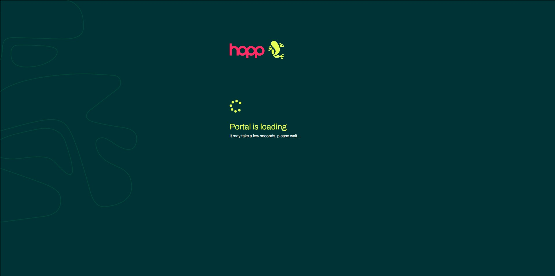
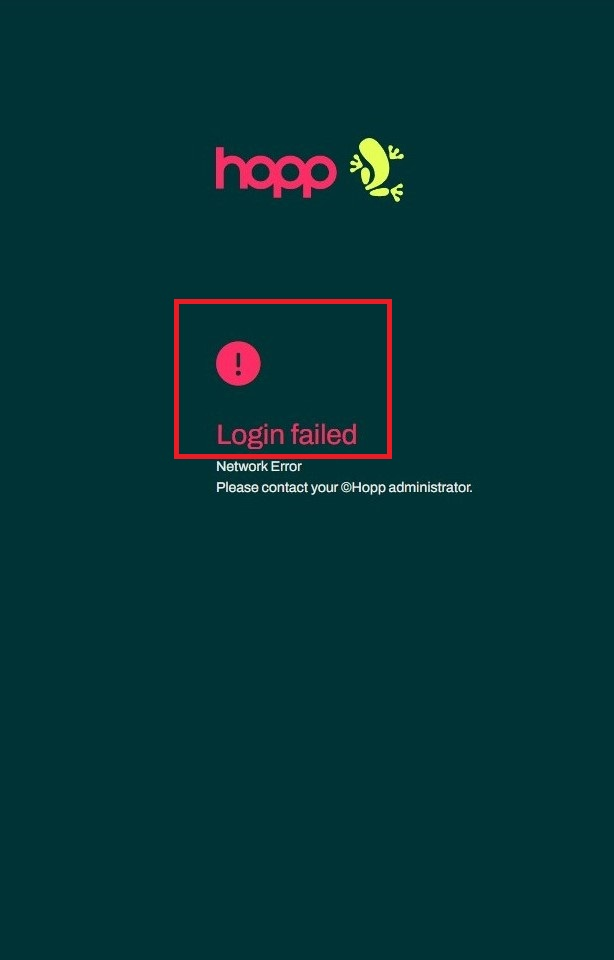
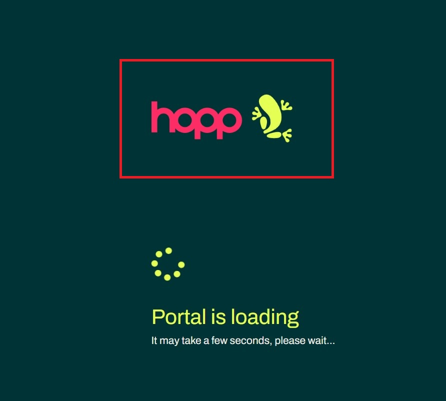
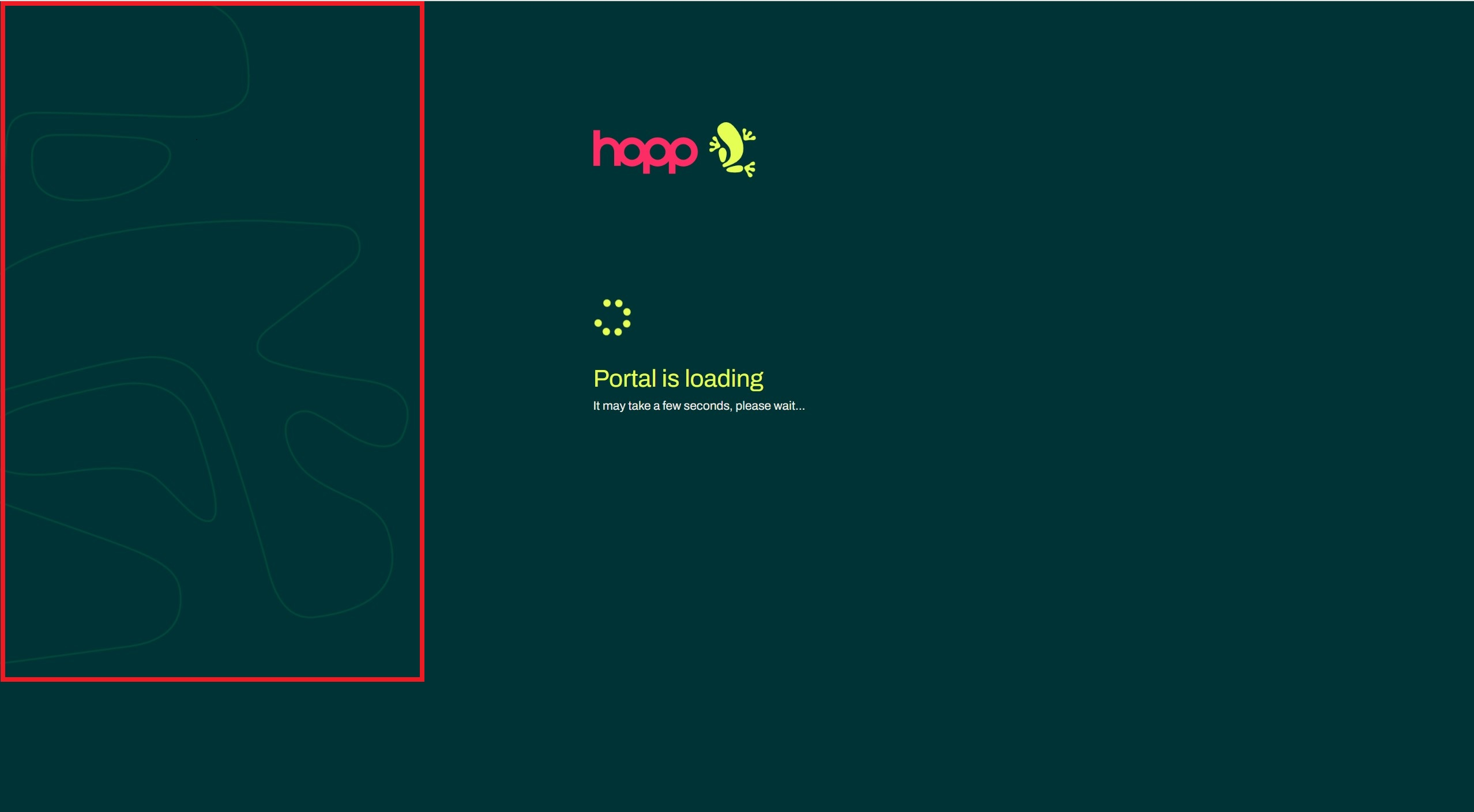
splash-screen-logo.png
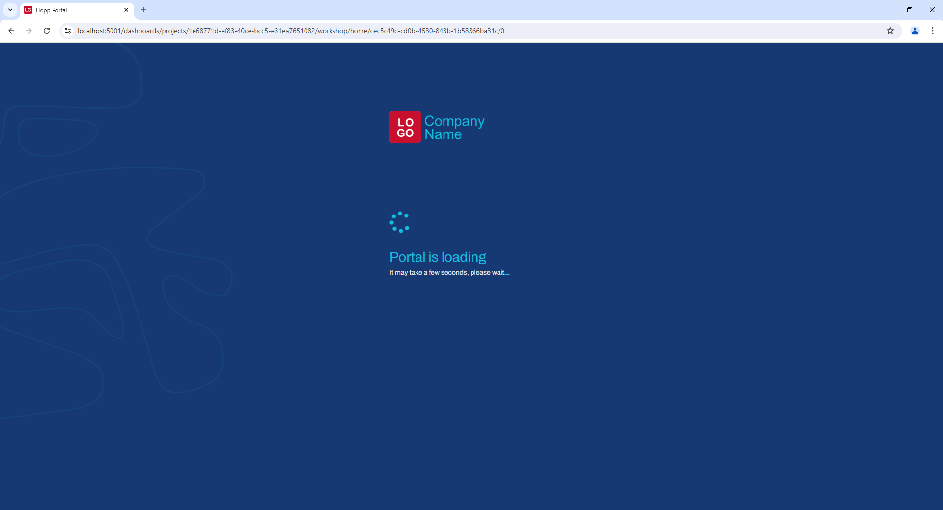
This image can be seen in the loading, authentication and error pages.
Recommendations
-
should be a
.pngfile -
should stand out on the chosen
--primary-color -
in order to obtain a similar layout as the one seen in the original Hopp interface the image should be rectangular with an aspect ratio that tends towards 3:1, and a height between 64px and 320px
- for example, the dimensions of the logo seen above are 353x120px the aspect ratio is not a hard constraint, even square-shaped images can be used as long as the height constraint is met
favicon.128.png and favicon.300.png
These are two instances of the same image, with different dimensions. They represent the icon of the portal and can be seen on the browser tab the Portal is running in.

Recommendations
- should be a
.pngfile - should be square shaped images of 128x128px and 300x300px, respectively
- should stand out on both light and dark colors, so it's visible on various browser themes
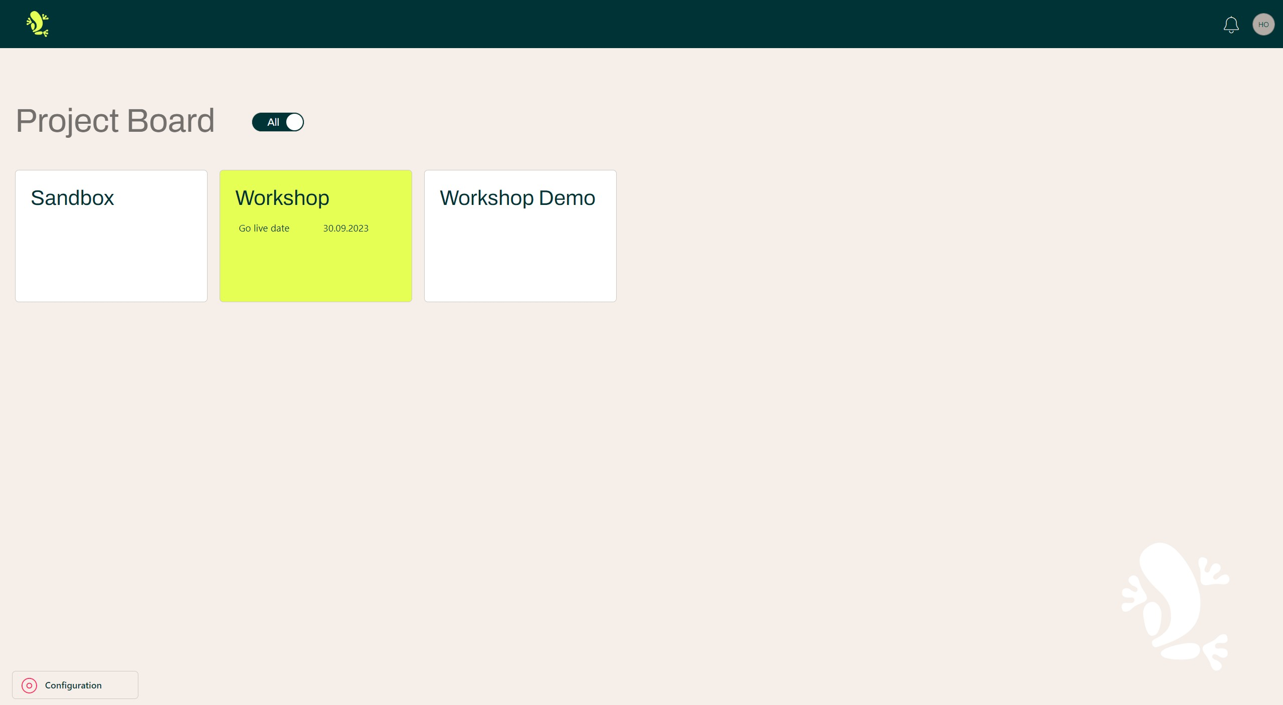
background-watermark.png [optional]
The most notable appearance of this image is in the bottom right corner of the project grid. However, this image can be seen on any page where the content doesn't fill up the whole viewport height.
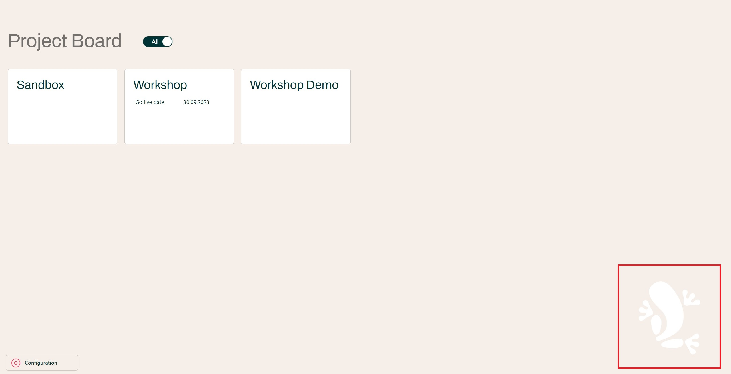
Since this is an optional image from a customization standpoint, an extra step is required, aside from adding it to the
img folder to have it rendered. The following code snippet needs to be added in the theme-styles.css file:
.main-layout__content {
    background-image: url('../img/background-watermark.png');
}
Your stylesheet should look something like this:
Note that without adding the aforementioned code, there will be no image rendered, irrespective of whether one was provided or not.
splash-screen-watermark.png [optional]
This is another example of an optional custom image, and similar to the background-watermark.png, it will require adding
a piece of code to the stylesheet in order for it to be rendered.
This image can be seen in the loading, authentication and error pages, accompanied by splash-screen-logo.png.
The snipped required for including the image in the custom styles can be found below:
app, main {
  background-image: url('../img/splash-screen-watermark.png');
}
Your resulting stylesheet should look like this.
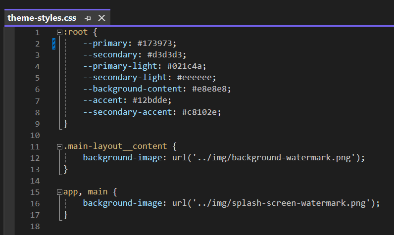
Note that the presence of one of the snippets is not conditioned by the other, as seen in the previously presented image.
Results
After setting up the resources that we've covered in this article, the only thing that remains to be done is to start the Portal website, or restart it, in case it's already running.
At this point our Portal should have a fully customized look.
Resources for the custom theme seen above can be provided on demand by your contact at Hopp Tech.